Overview — Dashboard
The Dashboard (route /) is the first screen you see after logging in. It combines the master series table with a tabbed overview of the full supply chain plan.

The screenshot above shows the Dashboard Overview tab with KPI cards, the network map, and the master series table below.
Layout
The top section has a tab bar with six tabs:
| Tab | Purpose |
|---|---|
| Overview | KPI cards and network map |
| Forecast | Aggregate demand chart, accuracy, method distribution, causal/maintenance panels |
| EOQ | Exchange curve and order-quantity analysis |
| IO | Fill-rate heatmap |
| Supply | Supply plan summary: open orders, shortages, coverage |
| Allocation | Allocation KPIs, DAG graph, backlog heatmap, waterfall, fair-share, violations, aging |
Below the tab bar sits the Series Table, always visible.

Toolbar Controls
- Pipeline selector — switches the active pipeline; all panels update
- Segment selector — filters every panel and the series table to a named segment; re-fetches all tab data on change
- Item / Site dropdowns — restrict the detail view on
/series
View Mode & Currency Dropdowns
Two dropdowns in the top toolbar control how numeric values are displayed across all dashboard tabs:
| Dropdown | Options | Description |
|---|---|---|
| View | Quantity / Cost / Price / Margin | Switches all KPI cards, charts, heatmaps, and tables between unit counts and monetary values |
| Currency | 30 ISO currencies (EUR, USD, GBP, …) | Selects the display currency; only visible when View ≠ Quantity |
How it works
- All database costs are stored in the global default currency (configured in Settings → System Configuration → UI →
default_currency). - When View is set to Cost, values are computed as
qty × avg_unit_costthen converted to the selected currency using live exchange rates from/api/currency-conversions. - When View is set to Price, values use
qty × unit_price. - When View is set to Margin, values use
qty × (unit_price − avg_unit_cost). - The conversion chain tries: direct rate → inverse rate → triangulation via base currency.
avg_unit_cost
Allocation, supply, and series endpoints include avg_unit_cost — a global average unit cost computed from master.item and master.item_location. When avg_unit_cost is 0 or missing, all value-mode panels display zero. This is the single most common cause of "empty charts in price/cost/margin mode."
Per-tab behaviour
| Tab | Quantity mode | Cost / Price / Margin mode |
|---|---|---|
| Overview | KPIs show unit counts | KPIs show currency values; map tooltip/legend adapt |
| Forecast | Demand chart in units | Demand chart converted to currency |
| EOQ | EOQ units | EOQ values in selected currency |
| IO | Fill-rate % (unchanged) | Heatmap cells show value instead of qty |
| Supply | Coverage weeks, shortage qty | Shortage value, coverage value |
| Allocation | Allocation qty, backlog qty | All panels show currency values; reservation timeline bars convert qty × avg_unit_cost |
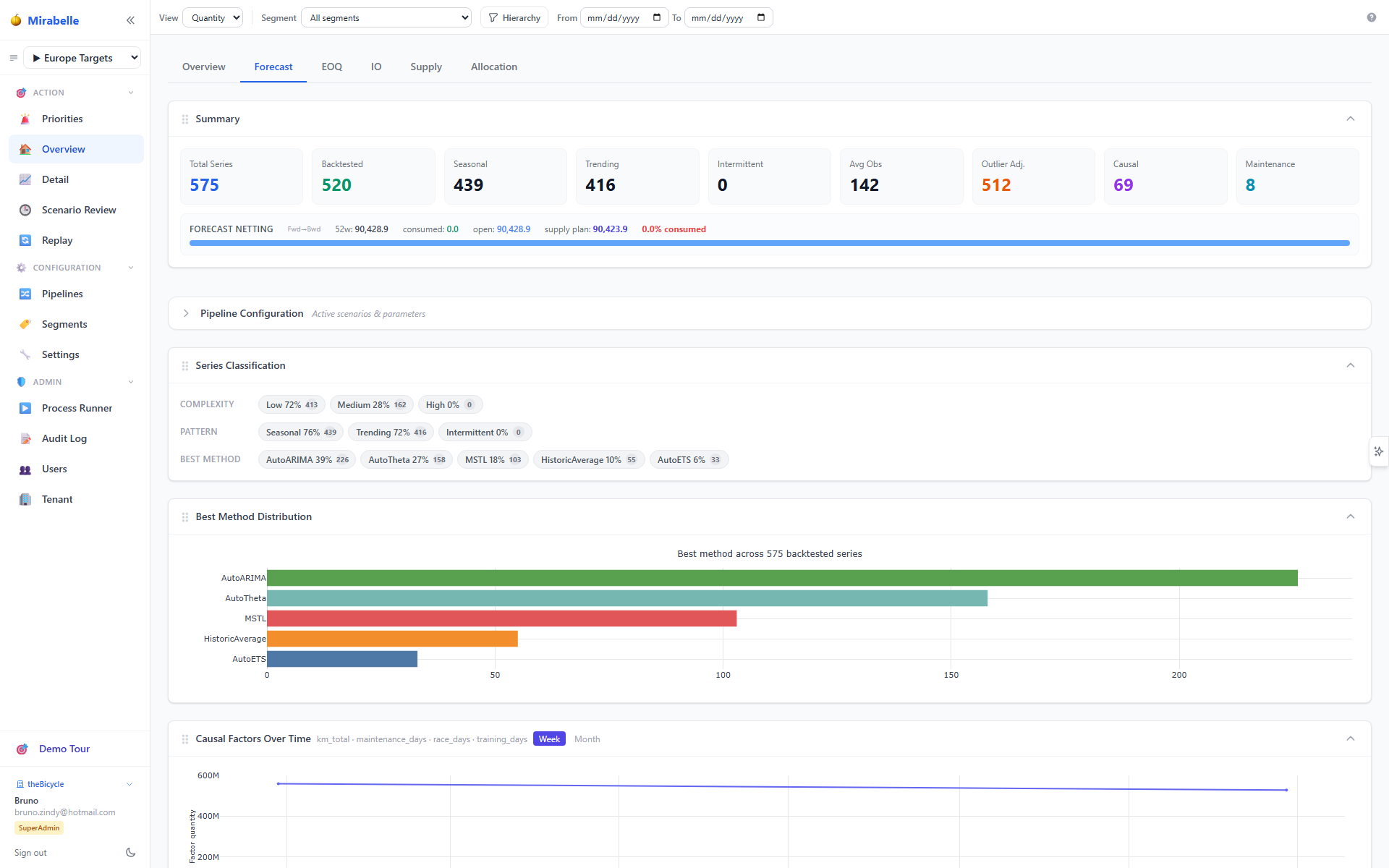
Forecast Tab
Panels (draggable, collapsible):
- Aggregate demand & forecast chart — sum of actuals plus best-method forecast for all series in scope
- View toggle — for multi-series views: Sum / By Item / By Site / Item × Site
- Series Classification — complexity, pattern flags, and method distribution for the current segment
- Best Method Distribution — bar chart of winning method counts
- Netting summary — consumed vs. netted vs. supply plan totals
- Accuracy vs. Precision scatter — MASE vs. bias per method
- Causal demand summary and Causal factors over time
- Maintenance demand top-12 and Maintenance weekly events
All panels respect the active segment and pipeline and re-fetch on change.
The Series Table
Columns
| Column | Description |
|---|---|
| Item | Item code (xuid). Click to open the Time Series Viewer |
| Site | Site code (xuid) |
| Obs | Weeks of historical demand |
| Complexity | low / medium / high |
| (Classification columns) | One column per active ABC/XYZ scheme, colour-coded |
| Interm. | Intermittent series flag |
| Seasonal | Seasonal pattern detected |
| Trend | Trend detected (hidden by default) |
| Mean | Average weekly demand |
| Demand | Inline SVG sparkline (grey = actuals, blue dashed = forecast) |
| Adj. | Outlier corrections applied |
| Best Method | Winning forecast method — shown in green |
| Features | Feature data status dots (see below) |
Features Column
Up to three coloured dots per series:
| Dot | Colour | Meaning |
|---|---|---|
| 1 | Green | Feature data available (global or series-level feature values exist) |
| 2 | Blue | Feature reliability assessed for this pipeline |
| 3 | Emerald | Features used in forecast (ML method produced feature_importance) |
Filter by state using the column header dropdown: data, assessed, or used.
ABC Colour Coding
| Class | Colour |
|---|---|
| A | Green #22c55e |
| B | Yellow #eab308 |
| C | Orange #f97316 |
| D | Red #ef4444 |
| X | Blue #3b82f6 |
| Y | Purple #a855f7 |
| Z | Pink #ec4899 |
Best Method Colour Coding
| Method | Colour |
|---|---|
| AutoETS | Blue #2563eb |
| AutoARIMA | Red #dc2626 |
| AutoTheta | Green #16a34a |
| SeasonalNaive | Purple #9333ea |
| CrostonOptimized | Teal #0891b2 |
| MSTL | Magenta #c026d3 |
| LightGBM | Amber #d97706 |
| XGBoost | Lime #65a30d |
| TimesFM | Indigo #4f46e5 |
Segment Filtering
The segment dropdown filters all panels simultaneously including the series table, demand chart, netting summary, accuracy scatter, causal panels, maintenance panels, type-count cards, and EOQ KPI cards.
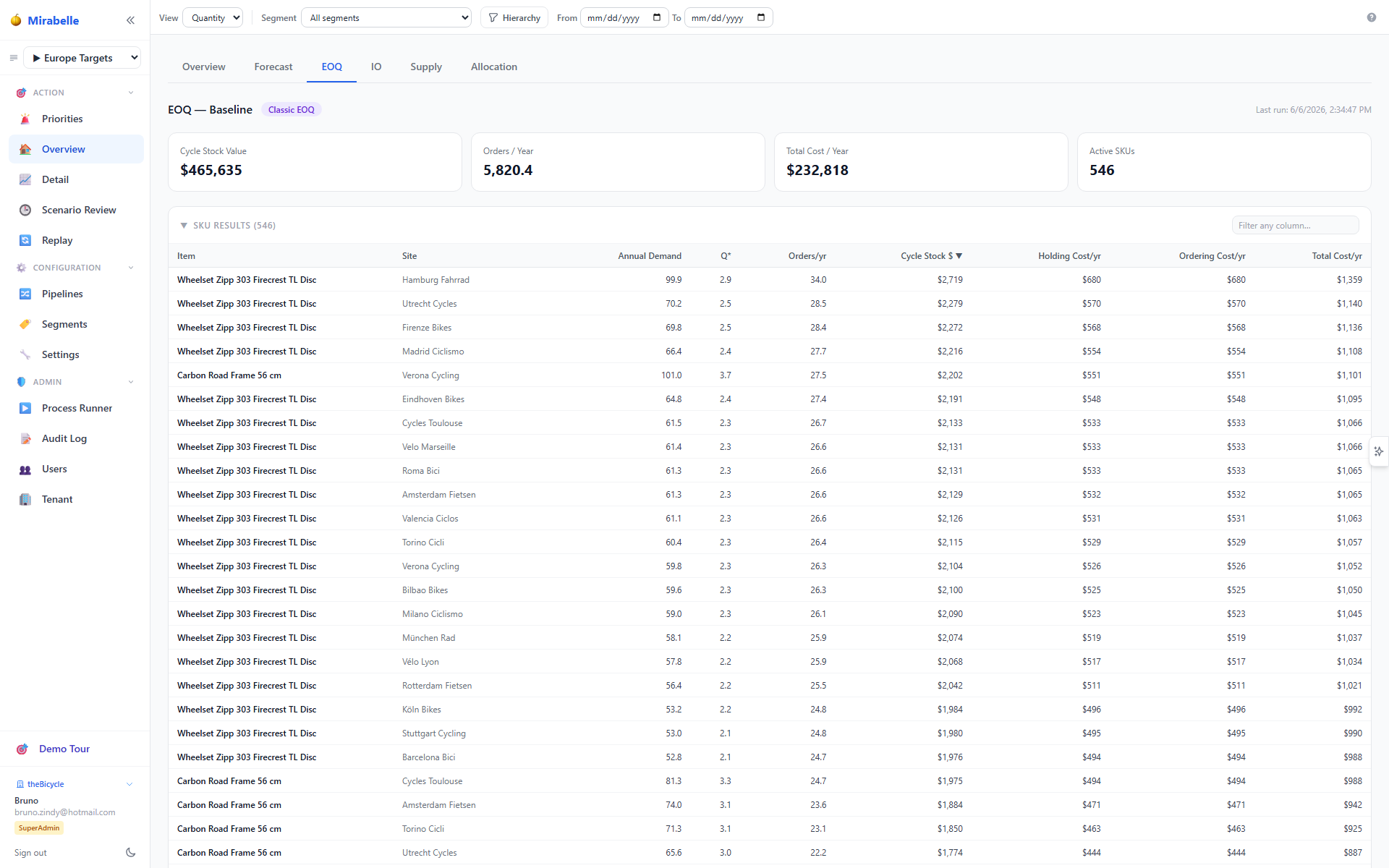
EOQ Tab
- KPI header cards — Cycle Stock Value, Orders/Year, Total Cost/Year, Active SKUs — computed from the filtered item list when a segment is active
- Items table — one row per item-site
- Order Frequency Options panel — when an
order_frequencyparameter is configured for the item, this panel shows all allowed replenishment frequencies with their order quantity, cycle stock value, and total annual cost. The selected frequency is highlighted, and orange markers on the cost curve chart indicate where each allowed quantity sits on the total cost curve.
IO Tab
The IO (Inventory Optimisation) tab shows the fill-rate heatmap and key MEIO performance indicators for the active pipeline's MEIO scenario.
KPI Cards
| Card | Description |
|---|---|
| Fill Rate | Demand-weighted average fill rate achieved by the MEIO optimiser, with the target fill rate shown as tgt |
| SL Qty / SL Value | Total safety stock quantity (quantity mode) or total inventory investment (cost/price/margin mode) |
| SKUs Optimised | Number of item × site combinations included in the MEIO run |
Fill Rate KPI — How It Is Computed
The Fill Rate value shown in the KPI chip is resolved in priority order:
- Optimiser group result — The demand-rate-weighted achieved fill rate from
PIPE_meio_group_resultsin ClickHouse, matching the MEIO optimiser's own computation. When segments are configured, the KPI reflects the selected segment's group result. - SKU-level fallback — If the optimiser group results are unavailable (e.g. the optimiser returned
achieved_fill_rate = 0for all groups, or the group results table is empty), the backend computes a weighted average from the same SKU rows used for the heatmap, using the scenario's basis weight (basis_weight— the MEIO scenario'sdemand_basis×demand_scopesignal, the same weight the heatmap cells use). - Frontend fallback — As a final safety net, the frontend can compute a
basis_weight-weighted average from the SKU-levelfill_ratedata loaded for the heatmap.
The target fill rate (tgt) comes from the MEIO scenario's parameter set (fill_rate_target), defaulting to 95 %.
Fill-Rate Heatmap
The heatmap plots SKUs on two configurable axes (default: 12-month forecast on X, unit cost on Y) with cell colour representing the selected metric (default: Avg Fill Rate).
- Dimension dropdowns — change X and Y axes (forecast qty, unit cost, lead time, demand rate, etc.)
- Metric dropdown — switch between fill rate, safety stock value, committed buffer, etc.
- Bucket controls — adjust the number of rows/columns (2–10)
- Colour mode —
Percentile(stretches to data range) orTarget(anchors 0–100 % scale to the fill-rate target; only available when metric = Fill Rate) - Group / Parameter Set dropdowns — filter the heatmap to a specific segment or MEIO parameter set
Click a cell to filter the SKU table below to only the SKUs in that bucket. Click again to deselect.
SKU Table
Below the heatmap, a sortable table lists every SKU with its fill rate, safety stock quantity/value, unit cost, 12-month forecast, and lead/wait times.
Supply Tab
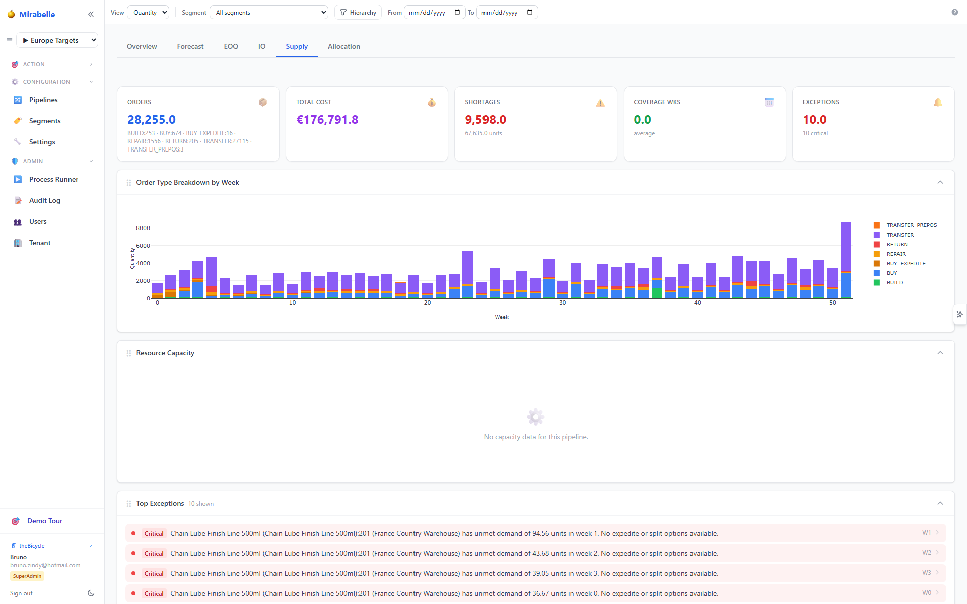
Summary of the active pipeline supply plan: order counts by type, coverage weeks, top shortage items, last run date. The Run Supply Plan button has been removed — supply runs are launched from the Processes page.
Allocation Tab
The Allocation tab provides a high-level snapshot of how demands are being fulfilled across the network.
KPI Cards
| Card | Description |
|---|---|
| Total Demands | Count of all allocation demands in scope |
| Filled | Demands that received a full allocation |
| Fill Rate | Percentage of demands filled (filled / total) |
| Unfulfilled | Demands with zero or partial allocation remaining |
Panels
- Allocation DAG graph — directed acyclic graph showing the flow of allocations from supply nodes to demand nodes; node size reflects volume, edge colour reflects fill rate
- Backlog heatmap — grid of site × period cells coloured by backlog severity; darker shades indicate larger unfulfilled quantities
- Waterfall chart — stacked breakdown of allocation volume from total demand through fulfilment steps to remaining backlog
- Fair-share chart — bar chart comparing each site's allocated share vs. its fair-share target
- Routing violations table — rows listing demand–supply pairs that violated routing constraints, with violation type and affected quantity
- Aging distribution — histogram of unfulfilled demands grouped by days since first attempt; highlights aging backlog
All panels respect the active segment and pipeline and re-fetch on change.
Navigation
Click any item or site in a panel to drill into the detail view. For the full allocation page with all controls and tables, see Allocation.

Mirabelle Panel Toggle
A sparkle icon button toggles the Mirabelle AI assistant panel:
- Desktop — fixed on the right edge of the viewport; click to expand or collapse the panel
- Mobile — located in the top toolbar; tap to open the panel as an overlay
The panel provides contextual suggestions, explanations, and on-demand analysis for the current dashboard view.
Next Steps
Click any row to open the Time Series Viewer. For items needing attention, go to Exceptions.