Forecasting — Planner's Guide
This guide explains forecasting in Mirabelle from a planner's perspective, without requiring knowledge of the underlying statistics. By the end you should be able to read forecast results confidently, choose between methods, know when to override, and understand what the metrics are telling you.
What the System Does
Mirabelle runs multiple forecasting algorithms simultaneously on each item-site time series and then picks the best one. The process is:
Figure: the six background steps Mirabelle runs when you click Run Forecasting.
flowchart TD
  A["Run Forecasting clicked"] --> B["Characterise series"]
  B --> C["Select candidate methods"]
  C --> D["Run all candidates in parallel (Dask)"]
  D --> E["Backtest on withheld history"]
  E --> F["Score and select best method"]
  F --> G["Store results in database"]
G --> H["Dashboard shows forecast & metrics"]- Characterise — determine what kind of demand pattern the series has (stable, seasonal, intermittent, etc.)
- Select candidate methods — based on characterisation, choose which algorithms are suitable
- Run all candidates — execute every candidate algorithm in parallel using Dask
- Backtest — measure how accurate each algorithm would have been on recent historical data (withheld for validation)
- Score and select — compare all methods using a composite weighted score across multiple accuracy metrics and pick the winner
- Store results — save the winning method, all individual method forecasts, and all metrics to the database
All of this happens in the background when you click Run Forecasting from the Process Runner or Pipeline tab.
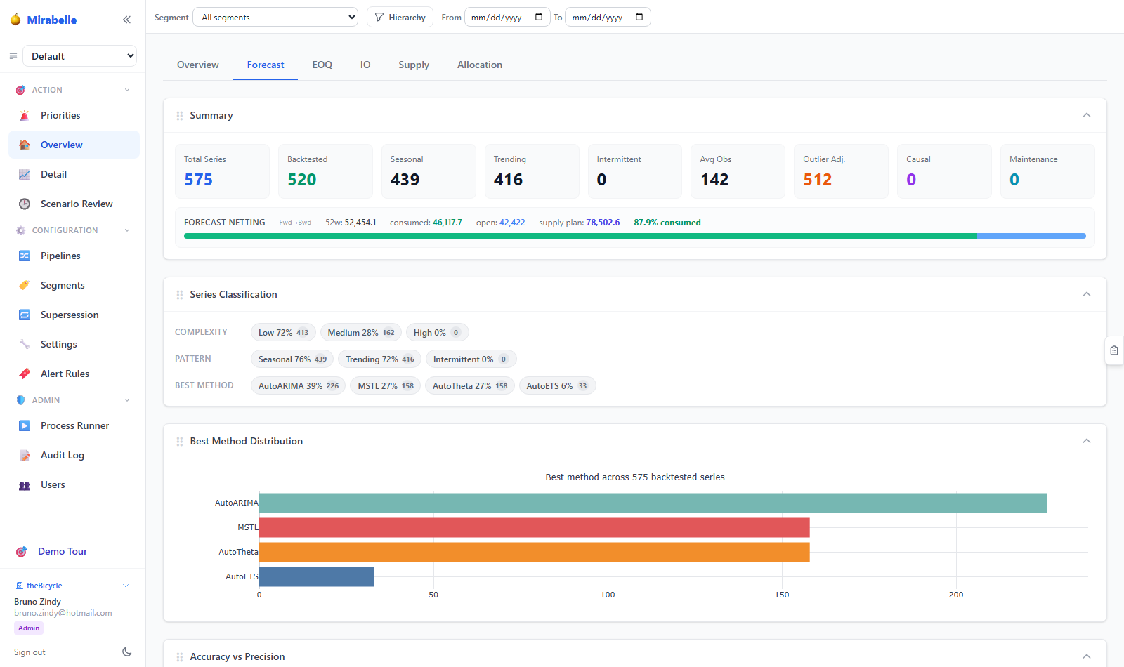
The Dashboard Forecast tab shows aggregate demand, method distribution and accuracy metrics.
The 24-Week Horizon
Mirabelle produces a 24-week (approximately 6-month) forward forecast. This is visible in the Time Series Viewer as the blue dashed forecast lines extending past the last actual demand point.
Why 78 weeks?
78 weeks covers two planning cycles and most supplier lead times. For items with longer lead times, the supply planning engine uses the full horizon for order placement decisions.
The horizon is configured by forecasting.horizon in the parameters. You can change it in Settings, but a re-run is required to see the change.
Forecasting Methods Explained
You do not need to understand the mathematics to use these methods effectively. Here is a plain-language explanation of each:
AutoARIMA
ARIMA stands for AutoRegressive Integrated Moving Average. It finds patterns in how today's demand relates to past demand (autoregressive), how the series has been trending (integrated), and how forecasting errors in the past propagate forward (moving average).
Best for: Series with a clear trend or autocorrelation in demand. Moderate seasonality.
Watch out for: Poor performance on intermittent demand; can be slow on very long series.
AutoETS
ETS stands for Error, Trend, Seasonality. The algorithm automatically selects whether each component (error, trend, seasonality) should be modelled as additive, multiplicative, or absent.
Best for: Series with stable seasonality. Often the most reliable all-rounder.
Watch out for: Can overfit short series.
AutoTheta
The Theta method decomposes the series into trend and "dynamic optimised theta" components. It has a strong track record in forecasting competitions.
Best for: Series with a dominant trend. Computationally light.
SeasonalNaive
The simplest seasonal method: the forecast for week N is the actual demand from exactly 52 weeks ago. No fitting required.
Best for: Highly seasonal items where the season is very stable and history is long. A useful baseline.
Watch out for: Cannot adapt to trend or growth. Poor when seasonality shifts.
HistoricAverage
Forecasts every future week as the average of all historical weeks. Zero adaptability.
Best for: Truly flat, non-seasonal demand. Useful as a fallback for very sparse series.
CrostonOptimized
Croston's method was designed specifically for intermittent demand (where many periods have zero demand). It separately models the interval between non-zero periods and the average non-zero demand size.
Best for: Intermittent series (ADI > 1.32). Typically auto-selected for intermittent items.
Watch out for: Do not use on non-intermittent series — it assumes sparsity.
MSTL
Multiple Seasonal Trend decomposition using LOESS. Handles series with multiple seasonality levels simultaneously (e.g. weekly and annual seasonality).
Best for: Complex seasonality. Retail items with weekly cycles and annual peaks.
TimesFM
A large pre-trained time series foundation model from Google. It has seen hundreds of thousands of time series during training and generalises well to new series with minimal data.
Best for: Short history, unusual patterns. Can handle items that classical methods struggle with.
Watch out for: Slower than statistical methods; requires GPU for best performance.
NHITS, NBEATS, PatchTST, TFT, DeepAR
Neural network methods. These learn complex patterns from the data and can model non-linear relationships.
Best for: Large datasets with complex patterns. Work best when trained on many similar series simultaneously.
Watch out for: More computationally expensive. Can overfit on small datasets. Require the neural forecasting pipeline to be configured.
How Method Selection Works
After backtesting, the system scores each method using a composite weighted score. The default weights prioritise:
Figure: how candidate methods are scored and the winner shown to the planner.
flowchart LR
  A["Candidate methods"] --> B["Backtest error vs withheld actuals"]
  B --> C["Composite weighted score"]
  C --> D["Best method selected (green)"]
  D --> E["Forecast shown on Dashboard & Time Series Viewer"]
  D -.-> F["Planner may lock alternative method"]
F --> G["Locked method used for future runs"]- MASE (primary metric) — normalised error relative to a naïve baseline
- Bias — systematic over/under-forecasting
- WAPE — weighted absolute percentage error
- Coverage — how often actuals fall within the confidence interval
The method with the best composite score is selected as the best method and highlighted in green. This method's forecast is the one used for supply planning and MEIO.
Reading the 24-Week Forecast
In the Time Series Viewer, the forecast is shown in two ways:
The main chart — all method forecasts overlaid on the historical actuals. The best method has a slightly thicker line. Use this to check whether the different methods agree or disagree. When all methods give similar forecasts, confidence is higher. When methods diverge significantly, treat the forecast with more caution.
The forecast table — numeric values week by week, with all methods in rows and weeks in columns.
For the best method, you will also see the confidence interval (shaded band). The outer edge of the band is the 95% confidence level: the system believes the actual demand will fall within this band 95% of the time. A very wide band means high forecast uncertainty.
When to Override a Forecast
The system is good at spotting patterns, but it cannot know about:
- Promotions and marketing events
- New customer wins or losses
- Planned price changes
- Supply disruptions that will shift demand elsewhere
- Seasonal events that changed year (e.g. Easter moving between March and April)
In all these cases, a planner override is appropriate.
Additive adjustment — use when you know demand will be higher or lower than the model suggests by a specific amount. Type the delta in the Adjustment row of the forecast table.
Full override — use when you have a specific confirmed number (e.g. a firm order received). Type the replacement value in the Override row.
Overrides are pipeline-scoped and do not affect other scenarios.
When to Change the Method
Changing the method makes sense when:
- The best method is consistently biased (always high or always low)
- The best method produces an implausible forecast for a known event
- A different method's line in the chart tracks actuals more closely visually
- The item's demand pattern has fundamentally changed (e.g. a formerly intermittent item now has stable demand after a new contract)
To change the method:
- Open the Time Series Viewer or the Exceptions forecast cell
- Select the alternative method from the method dropdown
- The new method is locked for this series
The locked method is used for all subsequent pipeline runs for this series.
Backtesting Period
Mirabelle validates methods using a rolling backtest. The backtest works by:
- Holding out the last N weeks of history (e.g. last 12 weeks)
- Training the model on all data before the holdout
- Forecasting the holdout period
- Measuring the error against the actual (known) values
This is repeated for multiple holdout windows to get a statistically robust estimate of how each method performs.
The backtesting period (number of holdout windows and window size) is configured in the Evaluation section of Settings.
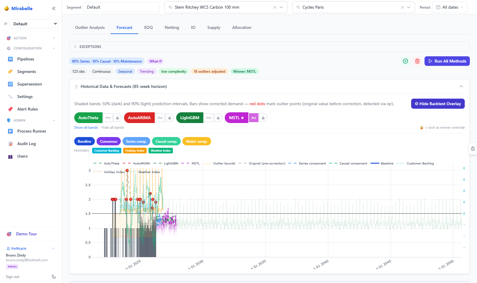
The backtest review panel in the Time Series Viewer compares each method against withheld historical windows.
More backtesting windows = more reliable metric estimates, but slower runs
For production use, 4–8 rolling windows is typically a good balance. For large datasets with many series, fewer windows reduces runtime significantly.
Interpreting MAE vs Bias
MAE (Mean Absolute Error) tells you how big the errors are on average, in absolute terms. It does not tell you the direction. An MAE of 50 means the forecast is off by 50 units in an average week, whether that is 50 too many or 50 too few.
Bias tells you the direction. A bias of +30 means the forecast is 30 units too high on average. A bias of −20 means the forecast is 20 units too low on average.
A method with a low MAE and near-zero bias is ideal. A method with low MAE but high positive bias will lead to overstock. A method with low MAE but high negative bias will lead to stockouts.
For supply planning, bias matters as much as MAE. An unbiased method with slightly higher MAE is usually preferable to a very accurate but biased method.
MASE: The Key Metric
MASE (Mean Absolute Scaled Error) is the primary comparison metric. It scales the MAE by the average error of a naïve seasonal baseline:
Interpretation:
| MASE value | Meaning |
|---|---|
| < 1.0 | Better than the naïve baseline — the method is adding value |
| = 1.0 | Same as the naïve baseline |
| > 1.0 | Worse than the naïve baseline — the method is not helping |
For most series, you should see the best method with MASE between 0.6 and 0.95. MASE above 1.0 suggests the series is extremely difficult to forecast and simple methods may be more reliable.
Tips for Planners
Check bias before supply planning
Before a planning cycle, filter the Dashboard to items where the best method has a large positive or negative bias. These items are most likely to have supply problems.
Use the Ridge Chart to spot instability
The Ridge Chart in the Time Series Viewer shows whether the forecast changes dramatically each week. Unstable forecasts often indicate erratic demand — consider using a simpler method or adding a smoothing override.
Less is more for overrides
Override sparingly. Every override you set is a commitment that the model's output is wrong. If you find yourself overriding many items every week, that is a signal that the method selection or parameter settings need adjusting — not that every item needs manual intervention.
After a causal run, compare with statistical
If your organisation has asset-based demand, run the causal forecasting step alongside the statistical step, then compare the two in the Time Series Viewer. The causal forecast may be significantly different during periods of fleet change.